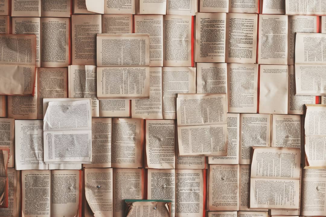
First-Person Cultural Historian POV: Vintage Paperback Open on Wooden Table
"La typographie est l’art de donner à la pensée une forme visible." (Typography is the art of giving visible form to human thought.) — Maximilien Vox
If you pick up a mass-market paperback printed within the last five years, you will notice a creeping, clinical disease.
The margins have shrunk to the width of a fingernail, squeezed by bean-counters calculating paper tonnage down to the microgram. The type is set in a generic, vector-rendered digital font—often a bastardized cut of Minion or Garamond—that floats on bleached white, chemical-smelling paper like grease on cold water.
There is no bite to the letterforms. There is no texture. There is no soul.
Now, reach into a wooden bin at a secondhand bookstore and pull out a 1974 Pelican paperback—say, an introductory volume on architectural history or an essay collection by E.P. Thompson.
The cover is matte, uncoated cardstock, adorned with a single, bold graphic woodcut or a modest typographic grid designed by Germano Facetti.
You open to page thirty. The type is set in Monotype Baskerville or Jan Tschichold’s Sabon.
The paper is an unbleached, creamy, high-bulk stock that has aged over fifty years into a warm tint of raw oatmeal.
And if you hold the page at an angle beneath a reading lamp, you can see the faint, miraculous physical impression—the bite—where a tiny slug of cast lead pressed hot ink physically into the fibers of the paper.